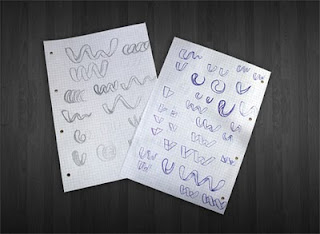
Logo design is a major factor that will be displayed when a product or company will be promoted in bulk. Choosing the right concept for a logo is necessary first point in designing a logo that fit with its mission, vision, and the credibility of a product or company.
Well, what should be a consideration when designing a logo that will be qualified?
1. Logo type
Text associated with logos, symbols, and a combination of both. Election Font Face appropriate course would be a determinant of the logo that will be created (the most appropriate example is Coca-Cola logo). So it is with symbols, it is definitely a fitting symbol of the company will make the image better again (example is the Nike swoosh). Any combination thereof, would give a different effect when compared to stand alone.
Choosing colors is easy-easy arguably difficult. It would be better if you involve some people in terms of color because their input could be very valuable. Colors are divided into two categories, namely the color of the light (spirit, energy, creativity, self-confident, happy, optimistic) and the color of pale / opaque (peace, harmony, honesty, calm, beautiful, inspiration). Selebih is white (not guilty or sterile) and black (elegant or evil).
3. Finally, keep it simple
Simplify the logo you created. The design was too complex are feared to make attention become fragmented and unfocused. Use color wisely (do not wear too many colors). Simplicity logo will show your product or company is more authentic and professional.[]
3. Finally, keep it simple
Simplify the logo you created. The design was too complex are feared to make attention become fragmented and unfocused. Use color wisely (do not wear too many colors). Simplicity logo will show your product or company is more authentic and professional.[]


0 Response to "Secrets of a Good Logo Design"
Post a Comment